NEW PARADIGM
Client
Tehama Technologies
Duration
6 weeks
My role
User Experience, Researcher, Visual assets
Tools
Figma, Adobe Illustrator
Problem
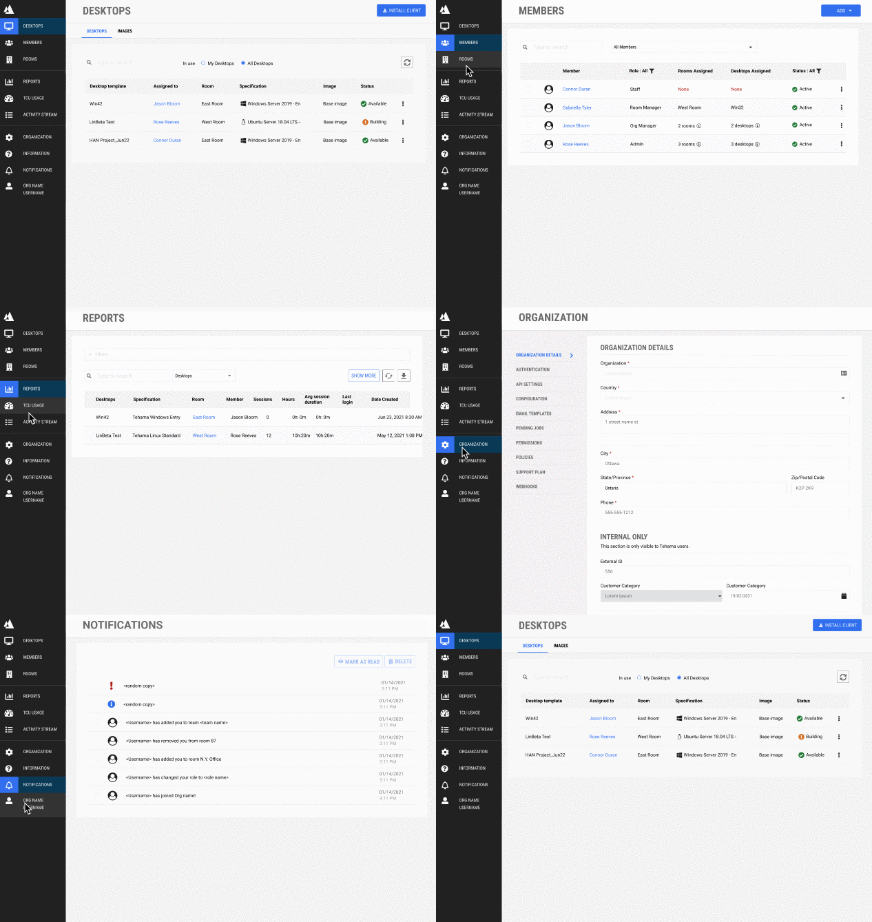
The existing admin platform had an unclear information hierarchy, a confusing sitemap, and inconsistencies in the visual interface. Due to these issues, users could not interact efficiently with the platform, reducing overall satisfaction.
Legacy platform layout and navigation
Solution
To improve the user experience, the focus was on making it easier to use and understand.
This involved the creation of a new paradigm in the platform by refining the navigation, updating the layout, restructuring the information hierarchy, introducing attention-grabbing elements and removing ambiguous terms to ensure the product resonates with the target audience's mental model creating a user-centric design.
01. Research
Investigating the problem
We conducted client touchpoint analyses using methods like the Book Cover Exercise to comprehensively understand user needs and behaviours. Additionally, we performed a design trend analysis, scrutinized competitors, and conducted user interviews through competitive analysis interviews.
User interviews
Competitive analysis interview
Competitors audit
Amazon WorkSpaces, Microsoft Azure, Twingate
Design trend analysis
Frameworks, design languages, etc
Client touchpoints
Needs, behaviours, and motivations, Book cover exercise
02. Ideate
Gathering ideas
Our ideation process involved brainstorming sessions focused on Jobs to be Done and key features. We utilized card sorting and mind-mapping techniques to organize and structure ideas. Sketching and role-playing exercises allowed us to explore various possibilities and expected user behaviours.
Card sorting & Mind mapping
Organize and structure ideas
Brainstorming
Jobs to be done, Key features
Sketching & Role-playing
Possibilities and expected behaviours
03. Solution
Opportunities
We've outlined key solutions to the platform's challenges: a revamped navigation system, attention-grabbing elements for incident awareness, and a structured overview page.
New Sitemap
We revamped the navigation system, information hierarchy, and lexicon to provide a more intuitive and user-friendly experience.
Awareness Elements
Introduced attention-grabbing elements for incidents to enhance user awareness and responsiveness.
Overview Page
Created new areas and reorganized existing ones to give users a clearer and more efficient platform overview.
04. Usability Testing
Testing the design efficiency
A comparative usability test involving 10 users was conducted, each assigned three tasks with a 7-minute time limit. Results significantly impacted user understanding and confidence in managing teams with the new version.
87% Improvement in
Platform Understanding
Users reported a substantial increase in comprehension after testing the new version.
75% Confidence
in Team Management
Users expressed confidence in their ability to manage teams using the revamped platform.
User quotes
One of the qualitative data gathered was User quotes. By expressing their thoughts and feelings, users contributed to a better understanding of what worked well and what needed improvement.
Positive Feedback
“Easier to follow and keep an eye on what really needed attention”
“It was quick to find high-level information.”
“Eye-catching”
“easy as a cookie-cutter”
Negative Feedback
“The dashboard was overwhelming”
“I felt lost when I arrived on the dashboard. It was just too much with the cards and attention markings…”
05. Next steps
Further improvements
Thanks to testing, anticipating user pain points became possible. For the upcoming iterations, the focus will be on two areas to allow a balanced approach aligning with both design goals and users' needs:
Reevaluate key information to ensure essential information is readily available and address the overwhelming feeling reported by users.
Reduce attention-grabbing Icons to maintain the discoverability of critical issues without overloading the user interface.
Lessons learned
During the sprints, several key insights emerged that underscore the significance of effective user experience design:
Prioritize In-Depth Research: A thorough understanding of user needs was crucial for effective design solutions.
Collaborative Design: Involving peers, clients, and stakeholders in design ensured a well-rounded perspective.
Never Discard Previous Ideas: Ideas that may seem unfeasible initially could be valuable in later iterations, emphasizing the importance of preserving a variety of concepts throughout the design process.


