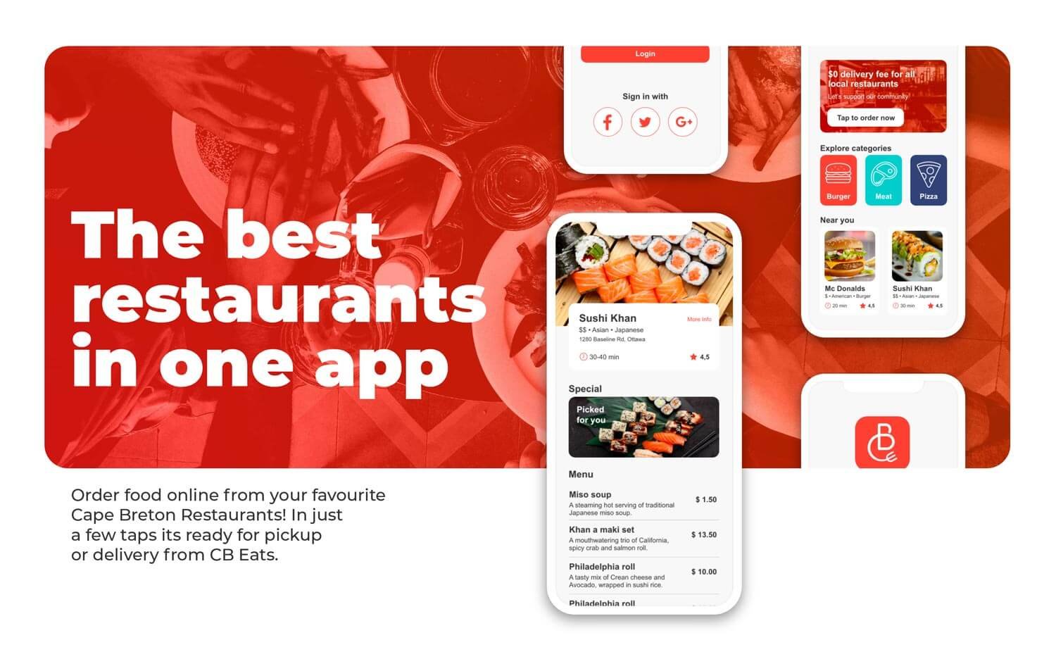
CB Eats: the best restaurants from Cape Breton one tap away
Client
Click2order
Duration
18 weeks
My Role
Product Designer, Graphic designer
Tools
Figma, Adobe XD, Illustrator
The Problem
CB Eats was developed on an old app framework and hasn't received any updates since it launched in 2019.
In addition, its navigation, key elements, and visuals are outdated.
The Goal
Provide an intuitive and enjoyable experience for the clients.
Increase confidence in first impressions.
Improve brand identity.
Decrease uninstall rate within the first month of use.
The Process
Follow the journey into exploring and understanding the problem, designing multiple solutions and testing each iteration. Many obstacles cause us start steps over again until finding the best solution.
01. Empathize
02. Define
03. Ideate
04. Prototype
05. Evaluate
06. Retrospective
01. Empathize
Understanding the User
To gain a thorough understanding of the food-ordering app users' needs, and motivations, this stage was divided into the following steps:
User interviews
Establish users’ pain points
Competitors’ analysis
Demographic research
Collect first insights
Analyzing the data
User Interviews
We interviewed ten working adults between ages 20 and 40, five of whom used CB Eats and five used other food ordering apps. Their responses can be summarised as follows:
People who use other food-ordering apps
Don’t like to think when using food-ordering apps
Prefers delivery
Likes to re-do the same order multiple times
Uses at least twice a month
Are open to trying different apps
People who used CB Eats app at least once
Don’t like to think when using food-ordering apps
Don’t have preferences between delivery or takeout
Likes to re-do the same order multiple times
3 of 4 deleted the CB Eats app within one month
Pain Points
Based on the intersection of audiences, three major pain points were identified:
1
Too many options
A large selection of restaurants can be overwhelming, delaying the choice or leading to doubts.
2
Outdated aesthetics
The obsolete visuals and the lack of restaurant and menu images cause apprehension, questioning the app's reliability.
3
Long user journey
Having to go through many steps to complete the order is frustrating, leading to boredom.
Competitors’ Analysis
We audited three of the most popular direct competitors on the market to understand better the landscape in which CB Eats operates.
Objective
To understand how existing food apps are used and any issues (if any) they encounter.
Research questions
How does their app look and feel? Are they attracting the same audience as CB Eats? What features are more attractive?
Procedures
We reviewed each competitor's audience, first thoughts, content, visual design, and user interaction.
Key competitors
With a country-wide presence, Uber Eats, Skip the Dishes, and DoorDash accepts restaurants and drivers as partners. Additionally, they earn income from commissions, subscription fees, white-label logistics services, and advertising.
Competitors’ products type and quality
Their apps are well-designed, have great customer-tailored offers, remember users' favourite restaurants, and are accessible to English and French speakers. However, their vast array of options may cause users to lose focus on their original intention and feel overwhelmed.
Competitors’ position in the market
80% of food orders are placed by these three competitors, which target Gen Z and Millennials and parents of young kids looking for a convenient food delivery service.
How competitors talk about themselves
Their service claims to help remove the cognitive load of choosing your preferred food. Still, their users are overstimulated by the variety of colours, animations, and options to choose from, delaying their selection.
Competitors’ strengths
Fast delivery, customers can get their food delivered within 15 minutes
Flexibility in food delivery service from instant lunch or dinner deliveries for select dishes or full-menu options from restaurants.
Transparency in pricing, fee and taxes.
User-friendly mobile app.
Competitors’ weaknesses
Competition from other similar apps leads to a lack of brand loyalty.
Mistakes from drivers or merchants can reflect badly on the app’s services.
The high activation fee for restaurants’ sign-up.
Restaurant can’t use their drivers, making fee deliveries higher.
Gaps
Users are not able to pre-order food.
There is no possibility of subscribing to specific restaurants.
Opportunities
Offer daily deliveries from chosen restaurants.
Provide options to pre-order food up to 5 days ahead.
First Insights
These are the key findings that would help shape this project:
Local community
Cape Breton is a small city and its population is proud of knowing its restaurants and people.
Keep it simple
Rather than creating a new paradigm, the users just want something that's easy to understand.
Lunch box
Users like to eat in the same place on regular bases. We can provide recurrent deliveries from their favourite restaurants.
02. Define
To answer this question, it was necessary to give a face and create a relationship with our expected user.
What need to be done?
Personas & Problem Statements
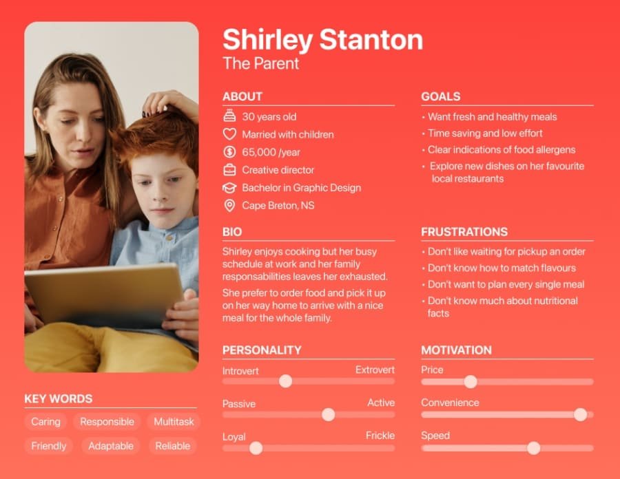
With the knowledge we gained from the empathize phase, we identified our demographic and psychographic segmentation and divided our potential users into three categories: Restaurant owners, parents with young children, and working adults between the ages of 22 and 40.
Considering the user's needs and behaviour when ordering food, we developed three personas representing your target customers. In addition, we assigned different problem statements to each persona.
These user personas were often revisited to ensure that we remained user-centric throughout the project and understood their needs and frustrations when using CB Eats.
Problem statement
Gregory Smith is a millennial sales representative who needs to adapt his taste with little effort because he lacks the understanding of how to match food items to discover new dishes.
Problem statement
Shirley Stanton is a working parent who needs a time-saving process to order and receive fresh and healthy meals on the go because her busy schedule leaves her too exhausted to cook for her family.
Problem statement
Laura Wilson is a small dining owner who needs a loyal customer base in her local community because she wants to expand her daily sales by serving fewer food options.
User Journey & User flow
The goal was to create intuitive and obstacle-free paths for users to reach their goal: enjoy their food. So we devised journey maps portraying the entire sequence of events and interactions each persona would experience.
The way each persona interacts with the app changes according to their goal, so a user flow in the app was also necessary.
Core features
We chose the “How might we” approach to develop as many features as possible to make CB Eats' redesign more relevant to their community. After narrowing down the options, we proposed three core features to make food ordering more appealing and comfortable for each target group.
Taste match
This feature would allow users to explore restaurant recommendations based on their tastes and previous orders.
Nearby restaurants
This option can show restaurants based on distance, simplifying the food-picking-up process and speeding up delivery times.
Orders subscription
Subscribers can get their favourite dishes weekly or biweekly without placing multiple orders.
03. Ideate
Design decision
As this project required a full review of the app’s behaviour and branding while ideating the sketches and layouts, a new visual identity needed to be developed.
Solution
It was necessary to break the ideation step into two parts: one for the design system and one for the sketches and information architecture. Then I could tie it all together to work on the prototypes.
Part 1: Visual design
Visual Concept
To make CB Eats stand out over its competitors, it was necessary to keep the user’s need in mind and their objective when using the app: order a meal after a long day of work. This was the starting point for shaping the visual concept.
All persons had one thing in common: they live in Cape Breton and are looking for a community-based restaurant whose food tastes like home without losing the discovery effect. For this reason, the visual keywords were comfort food, modern and warm.
Mood board
I created an InVision board to upload references. Then, the team and I had a Design Jam to discuss, choose and generate solutions for combining the graphic elements into the app.
Design system
To reinforce CB Eats’ first impression and to provide a unique visual for the app, I reformulate its brand and design system language to ensure future consistency throughout the app.
Part 2: App Behaviour
Information Architecture
With the core features in mind, we conducted a card sort to gain insight into how the content must be organized and displayed, resulting in the sitemap.
Sketches and low-fi wireframes
I began the process by sketching out various wireframes for the key screen on the app with different approaches for the core screen pages.
Once I determined the best combination of features and elements, I expanded the layouts by creating additional screens to ensure the new paradigm was effective. My focus was on enhancing the user experience by optimizing the app's functionality and usability.
04. Prototype
Mid to High-Fidelity Prototype
Next, I created mid-fidelity wireframes in Figma. During the process, I realized we would have to adapt some ideas to provide a better experience, show relevant information, maximize space, and add critical elements like the bottom menu.
Design changes
The stakeholder's initial request for the Onboarding - Login flow was to include as many web logins as possible, with the goal of simplifying the end user's experience. However, during the first round of user testing, I found that the resulting design was overwhelming for users due to the fields and buttons quantity.
To address this issue, I reevaluated the design and focused on including only the most common options for our users. Additionally, I added an alternative flow that would allow the user to create their account if they prefer.
Although the home screen layout seemed adequate during the sketching stage, after moving to Figma, I realized that the information architecture required improvement. Certain design elements were more prominent than others, making users feel overwhelmed with the excessive number of cards and clickable areas.
I reviewed and refined the layout making small but impactful changes. The final wireframe resulted from this iterative approach and proved effective enough to proceed with the prototype phase.
App hierarchy
The areas for Cb Eats were defined in the sitemap according to their importance in the information hierarchy to ensure an intuitive structure that seamlessly guides users through the app.
The app areas, in turn, are designed to support the information hierarchy, ensuring that each app section is easily accessible and visually consistent. Ultimately, a well-designed sitemap, information hierarchy, and app areas work together to create a user experience that is intuitive, engaging, and effective.
Home screen:
The first screen users will see after logging in provides easy access to popular restaurants, dishes, and deals. It serves as a hub for quick and convenient browsing.
Explore:
Where users can discover new and exciting dishes, cuisines, and restaurants. We've designed this area to make exploring food options fun, personalized, and engaging.
Orders:
Displays past orders, allowing users to easily reorder their favourite meals or schedule recurring orders. We've also included a subscription option, allowing users to enjoy their favourite dishes without manually ordering each time.
Account:
To manage personal account settings, payment methods, delivery addresses, and personal information. We've also allowed restaurant owners to add their info and manage their listings, ensuring a seamless experience for users and businesses.
Home screen
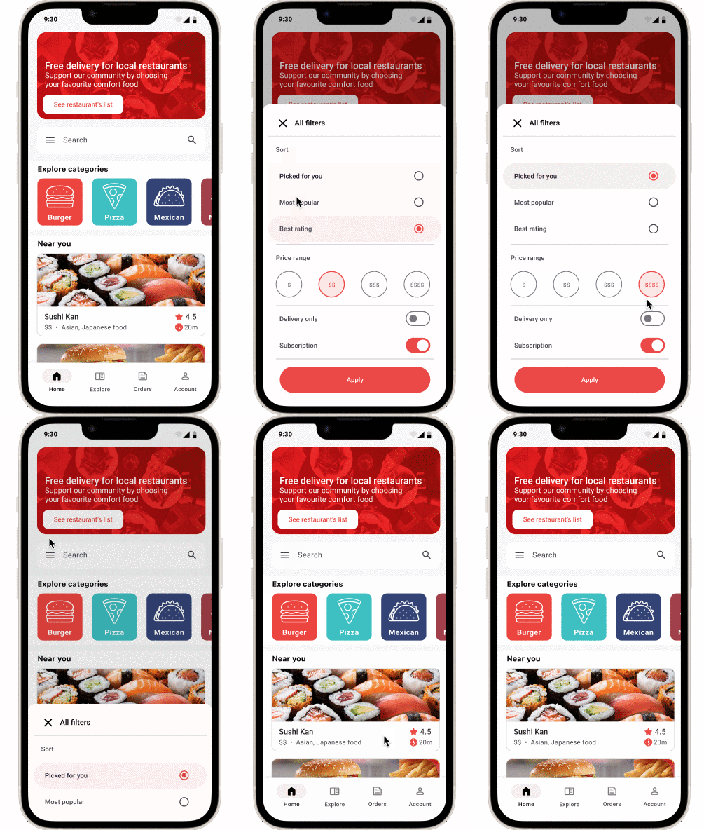
This is the first screen you see. It shows a promo area, search field, food categories and restaurant list.
Search: Allows the user to search for restaurants or cuisines.
Categories: All cuisine categories are available on the carousel, with the most popular options first.
Restaurants: To view all the available restaurants based on their location.
Orders
The Orders area is the perfect hub for users to take full control of their past orders and subscriptions.
For customers who frequently order from the same restaurant, CB Eats also has subscription options, allowing users to select any past order to be delivered according to their needs.
Explore
This area allows users to discover new restaurants and dishes. With a quick questionnaire, the app cross-references the selections with the user's past orders, providing relevant suggestions.
The results options can be added to the user’s cart. The goal is to make the ordering process as convenient as possible. If the user decides to go on with one of the suggestions, they can add to their cart with a few taps.
Additionally, the app only displays restaurants currently open and available for delivery or pickup.
Account
Last but not least, the account area has some key features, such as: Personal Information, Payment options, Addresses and more.
Owner area: Users can log in as Restaurant owners to be redirected to the owner portal to edit their restaurant’s information and add dishes, promotions and subscription options.
05. Evaluate
Usability testing
To stay on track, usability tests were needed to see what users liked and disliked before moving forward. The users were given three scenario-based tasks, and after each task, they were asked how they felt about the process and the app.
The testing was recorded, and, using a rainbow spreadsheet, we analyzed the data faster in a comprehensively and visually appealing way.
Testing key findings
Positive
Users were able to complete tasks quickly.
Users enjoyed the explore area with the taste match questionnaire.
The bottom menu proved easy for users to understand.
Negative
Users were confused with takeout and delivery filters
Users had trouble in the order subscription area.
Final Product
After many tests, iterations, and accessibility checks, the final product aligned with all of the objectives set in place - it had the necessary aesthetics update alongside new features making the product visually appealing and easy to use.
Click here to view the final prototype.
06. Retrospective
Final Thoughts
This was an amazing project I had the opportunity to participate. This new version helps CB Eats consolidate its brand and be a competitive service in its field.
Challenges
As most people interviewed were unable to express clearly what they didn't like nor what they wanted, we had to pay attention very closely to the recordings and tests to gather insights. We kept going back to the interviews at different stages to ensure we were on the right track.
What can be improved?
As CB Eats is an existing app and its stakeholders had a clear idea of what they wanted, some steps in the UX process were completed in different orders, making the process more complicated. It was necessary to keep correlating impressions and demolish many biases in different areas to serve the greater good.
Another important item was the design system. It was developed based on what we needed at the moment. Ideally, I would like to create a full brand manual to keep the physical and digital elements of CB Eats cohesive.
What’s next?
I spent a lot of time researching accessibility best practices toward the end of this project, and I believe that CB Eats will benefit greatly from more tests in this area.
The taste match feature hasn't had enough time to be developed. Sometimes interesting ideas might not have a straightforward implementation, and that's okay. Hopefully, a later version will include it.
Working on this project has been a great experience, and I'm looking forward to seeing it come to life.


